2027 Interior Design Trends and Paint Colors: Try Them on Your Own Room Photo
Short answer: There is no single 2027 Color of the Year; each company announced its own. AkzoNobel and Dulux chose Soulful Sage, a silvery sage green, Sherwin-Williams chose Celery, a light green, and Benjamin Moore chose Webster Green, a classic, dark-toned green. All three are green, but the tones are far apart. As of 11 November 2026, Pantone's page does not name a 2027 color. This guide puts the colors in one table with their sources. Before you repaint, you can try the tone you like on a photo of your room with BentoMesh, a Turkish-first AI visualization platform; the image is not a paint swatch, so make the final call with a real sample.
Batuhan Oğan · 14 min read · Published: 2026-11-11 · Updated: 2026-11-11
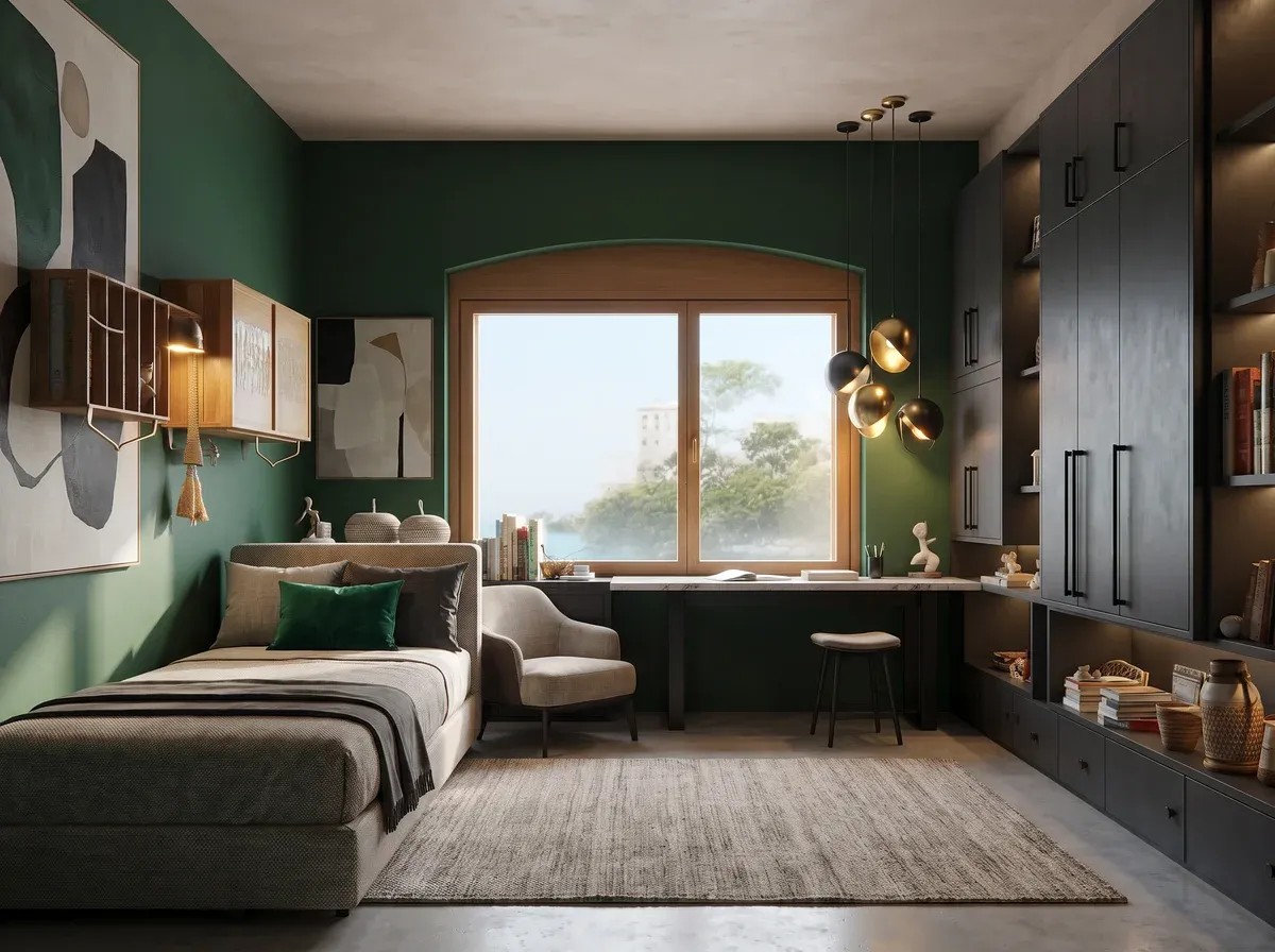
What are the 2027 interior design trends, and is there a single Color of the Year?
There is no single 2027 trend and no single Color of the Year. Paint brands publish their own colors; magazines and shops publish their own forecasts. These themes stand out in the sources:
- Green: AkzoNobel, Sherwin-Williams and Benjamin Moore each picked a green as their color of the year.
- Earth and mineral tones: House & Garden South Africa writes that white walls will keep making way for richer, moodier hues inspired by nature; Nordic Nest says mineral hues stay at the forefront and muted clay takes center stage.
- Layered lighting: House & Garden South Africa says a single ceiling fixture is giving way to a mix of pendants, sconces, floor lamps and concealed LEDs.
- Natural stone, raw finishes and handmade pieces: House & Garden South Africa highlights natural stone and handcrafted pieces; Nordic Nest highlights raw finishes.
- Nostalgia: Jotun Türkiye's 2027 collection has a theme called Hatıralar (Memories); Nordic Nest talks about curated nostalgia.
These are announcements and forecasts, not sales or survey data, so this guide gives no percentages.
Which wall colors have paint brands announced for 2027?
The table lists only sources whose pages we opened and read; each link goes to the source.
| Source | 2027 color | Tone | Announced |
|---|---|---|---|
| AkzoNobel release, Dulux news | Soulful Sage | Soft, silvery green, at the center of three color stories called Glow, Light and Lift | 8 September 2026 |
| Sherwin-Williams | Celery SW 6421 | Soft, light green with subtle yellow undertones | No date on the page |
| Benjamin Moore release, color page | Webster Green HC-130 | A classic green that Benjamin Moore calls a confident hue; light reflectance value (LRV) 20.2 on its color page (0 is black, 100 is white) | 14 October 2026 |
| Jotun Türkiye (Turkish site) | 2027 interior color collection, titled Yolculuklar (Journeys) | Not a single color: 24 colors in three themes, Hatıralar (Memories), Keşifler (Discoveries) and Deneyimler (Experiences) | No date on the page |
| WGSN and Coloro | Luminous Blue (Coloro code 125-28-38) | Blue; WGSN's color strategist calls it both mysterious and eccentric. Not a paint brand: WGSN and Coloro offer color forecasting and color tools | 29 April 2025 |
| Pantone | No name on its page as of 11 November 2026 | The page shows Cloud Dancer for 2026 and lists four December events under a 2027 heading | Not announced |
AkzoNobel's page lists Dulux in its brand portfolio and Dulux's 2027 news names the same color, so the two share a row. Jotun Türkiye's page mentions 24 colors, and 20 show in the visible list, among them kilim, amber red, velvet plum and almond beige. The page does not say which color belongs to which theme.
Other brands may have announced 2027 colors too; the table holds only the ones we could open and verify. Whichever brand you paint with, ask the dealer for the equivalent of your chosen tone in that brand's own color chart.
Which tones come with the colors of the year?
A color of the year rarely arrives alone; all four sources below attach a palette or a theme to it. If you plan to take a green to your wall, this shows what each puts next to it.
| Source | Colors and themes announced with the color of the year |
|---|---|
| AkzoNobel | Three color stories: Glow (a warm space built on earth tones), Light (quiet, pale tones mixed with darker ones for a healing space), Lift (positive tones for a joyful, inspiring space) |
| Sherwin-Williams | Coordinating hues listed in the article: Kirsch Red SW 6313 (a bold pop of energy), Potentially Purple SW 6821 (an uplifting twist), Cosmos SW 6528 with Georgian Bay SW 6509 (a calm contrasting pair), Woven Wicker SW 9104, Plum Brown SW 6272 and Artichoke SW 6179 (warm neutrals that ground the palette), White Flour SW 7102 with Cocoon SW 6173 (a soft, airy backdrop) |
| Benjamin Moore | The eight-color Color Trends 2027 palette, Webster Green plus White Down OC-131, Nelson Blue CW-635, Shakespeare Tan 228, Antique Copper 1169, Wild Aster 1240, Durango 2137-30 and Townsend Harbor Brown HC-64 |
| Jotun Türkiye | Hatıralar (natural, warm, timeless tones), Keşifler (fresh, energizing colors), Deneyimler (classic, balanced, strong tones) |
These names and codes belong to each brand's own color chart. On a photo, describe the tone instead of typing a code; the tool does not match brand codes. The steps below show how.
Which interior directions are being discussed for 2027?
Each of the six directions below is what the named source says; sentences that start with “At home” are our own suggestions.
- Green, at different depths. AkzoNobel chose a soft, silvery green; Sherwin-Williams a light green with subtle yellow undertones; Benjamin Moore a classic, dark-toned green. At home: the same green family looks very different from one tone to the next, so decide first whether you want the room light or dark.
- Earth and mineral tones. In its 1 August 2026 article, House & Garden South Africa says white walls will keep making way for richer, moodier hues inspired by nature. Nordic Nest says mineral hues stay at the forefront and muted clay takes center stage. AkzoNobel builds its Glow color story on earth tones. At home: shades between beige and clay are a light way to start, on one wall or behind a cabinet.
- Blue. Nordic Nest calls Klein blue one of the boldest accent colors of 2027. WGSN and Coloro picked Luminous Blue as their color of the year, but that is a color forecast, not a paint chart. At home: try a blue accent on a curtain, a cushion or a single chair; it is far easier to undo than a painted wall.
- Layered lighting. House & Garden South Africa writes that pendants, sconces, floor lamps and concealed LEDs work together instead of one overhead fixture. At home: wall color shifts with the light, so count the lamps in the room when you choose it. You can test light on a photo with the Lighting task in Edit Render, covered in the steps below.
- Natural stone and raw finishes. House & Garden South Africa says marble, travertine, quartzite and limestone are moving from a practical finish to a statement feature. Nordic Nest lists wood that keeps its grain, carved stone and rusted Corten. At home: look at the floor and countertop together with the wall color; a surface next to a color changes how you read it.
- Handmade pieces and nostalgia. House & Garden South Africa writes that handcrafted ceramics, woven textiles and bespoke furniture are replacing mass-produced accessories. Nordic Nest describes curated nostalgia: comforting familiarity added lightly to modern interiors. Jotun Türkiye named one of its collection themes Hatıralar (Memories). At home: keeping an old rug or a wooden cabinet and choosing the wall to match its tone gives you this direction without a big spend.
How do you try these colors on your own room photo?
Two BentoMesh tools help you see a wall color on your own room photo before you repaint: Edit Render in Render Lab for one tone at a time, and Style Comparison for several style directions side by side.
| What you want to do | Where | What happens |
|---|---|---|
| Try one tone on a wall | Render Lab, Edit Render, Material task | Interface hint: only materials and colors change; object positions, shapes and lighting are kept (the goal, not a guarantee) |
| See the same room at sunset or in daylight | Edit Render, Lighting task | Interface hint: only light, shadows and time of day change; the space and furniture stay the same (the goal, not a guarantee) |
| Find which style direction suits the room | Style Comparison, interior mode | Your photo is rendered side by side in up to 8 of the 34 interior styles you pick |
1. Prepare the photo. Shoot the room in daylight, with the curtains open and the corners in frame. The file must be JPG, PNG or WEBP, up to 15 MB.
2. Open Edit Render. Render Lab has three tabs: Edit Render, Generate from Scratch and Quick Render. Edit Render opens first when you have no saved preference. Upload the photo there.
3. Pick the Material task. Under “What do you want to do?”, choose Material.
4. Describe the tone in words. Skip brand names and color codes and describe the color: “Paint the walls a soft, silvery sage green”. The built-in example reads “Paint the walls anthracite gray”; use the same pattern for your own tone.
5. Compare the result with the last version. The Compare button opens a Before / After view. In the Edit history, click any version to continue from it; “Apply to the original image” runs each try on the photo you first uploaded.
6. Change the light and look again. In the Lighting task, write “Give it warm sunset light” or “Increase the daylight from the windows” and watch how the same color shifts with the light.
7. Compare style directions. In Style Comparison, open the interior mode (labeled İç Cephe), upload the photo and pick up to 8 styles; the Nature category includes Biophilic and Wabi-Sabi. You can write the wall color in the Additional Instruction field, whose sample text is “Walls should be light blue”. With two or more successful results, a Download All as ZIP button appears.
You can describe the announced colors in words like these; fit each one into the “Paint the walls …” pattern:
- a soft, silvery sage green (close to the Soulful Sage description)
- a soft light green with subtle yellow undertones (close to the Celery description)
- a classic, dark-toned green (close to the Webster Green description)
- a warm earth tone between beige and clay
The tone you get does not match a brand code; it only shows the direction.
If you upload an image that looks like a floor plan instead of a room photo, the tool opens a warning window before it uses your credits and suggests Floor Plan Colorization. It may not recognize every plan, so make sure you upload the room photo.
Trend or timeless? How do you decide before you paint?
A color of the year is a one-year announcement, while paint stays on the wall for years. Check these six things before you decide:
- Which way the room faces. Jotun Türkiye writes that natural light in bedrooms with north-facing windows can lean blue or gray. Dulux's UK site says south-facing rooms get warm, bright light all day, while a north-facing room can look darker and cooler. The same green can read as two different colors in two rooms.
- Room size and the amount of light. In a room with little light, a dark tone can make the space feel darker still. Try a dark green like Webster Green on a small patch first.
- The floor, countertop and furniture that stay. The new color will sit next to them; check whether it agrees with the warm or cool undertone of the wood, stone and fabric you already have.
- A one-wall test. Think of the single wall people see first. If you dislike the color, only a small surface needs repainting.
- A real paint sample. The photo test shows direction. Put a sample of the tone you like on the wall and look at it in the morning, at noon and in the evening.
- Your lease, if you rent. You may have to return the wall to its old color, so check your contract. Trying the color in textiles and accessories first is a safe first step.
On expensive surfaces that are hard to change (floor, countertop, fitted cabinets), keep to calm tones and try the trend color on a wall or in textiles; that way you have no expensive surface to replace when the color of the year changes.
How do these colors work in a living room, bedroom and kitchen?
These are not sourced rules, only our suggestions.
- Living room. Try a soft or dark-toned green on one main wall and leave the others in a warm off-white. Check the color both in daylight and under evening lamps. If the sofa and floor are already fixed, choose the color to suit their undertone. To lay out furniture by the room's real dimensions, use Space Workshop.
- Bedroom. Calm comes first. Jotun Türkiye suggests a palette built on blue and green tones for north-facing bedrooms; AkzoNobel's Light story mixes quiet, pale tones with darker ones. The headboard wall is a small, easy-to-undo place to start.
- Kitchen. None of the sources we opened gives a separate 2027 color for kitchen cabinets. To see a green on cabinets, describe them in the Material task of Edit Render; one example in the instruction box reads “Make the kitchen cabinets white”. Ask your painter which paint suits the cabinet surface; wall paint is not always right for cabinets.
If you are suggesting colors to a client, show the same room in two or three tones side by side with Before / After and tie the decision to a sample.
What are the honest limits of this test?
A test on a photo helps you decide; it is not a paint order. Keep these in mind:
- A tone on screen is not a paint chart. Screens and phones show color differently, and paint on a wall looks different in the room's own light. Make the final decision with a real sample.
- A brand color code is not reproduced exactly. Typing “Soulful Sage” or “SW 6421” does not give you that paint; describe the tone in words. The green in the image may not match the brand's green.
- It is not a measurement. The image gives no paint quantity, wall area or room dimensions.
- Geometry can change. BentoMesh does not guarantee geometry is fully preserved; windows, doors or furniture shapes can come out differently. Compare the result with your photo.
- Processing happens in the cloud. Your photo is processed on the BentoMesh server and at a third-party AI provider that produces the image; check permissions for a confidential project.
- It is an illustration. When you show it to a client or use it in a listing, say that it is a generated image.
- The cover room is an example. The dark green wall on the cover is not any brand's 2027 color in the table.
- The free tier adds a watermark. Images generated on the free tier carry a BentoMesh watermark.
- There is no Android app. The tests in this guide run on the website.
- The information is dated. Colors and announcement dates were written from the source pages as of 11 November 2026; brands and Pantone may publish new information later.
Registration is free; when you verify your email or phone number, or sign in with Google or Apple, a one-time welcome credit is added to your account, subject to the conditions on the sign-up page. Current packs are on the credits page. Some pages linked here do not have an English version yet and open on the Turkish site. This guide is also available in Turkish: Türkçe sürüm / Read in Turkish.
Frequently asked questions
What is the 2027 color of the year?
There is no single 2027 color of the year; each company announced its own. AkzoNobel and Dulux chose Soulful Sage, Sherwin-Williams Celery, Benjamin Moore Webster Green, and WGSN and Coloro Luminous Blue. As of 11 November 2026, Pantone's page does not name its 2027 color. The table in this guide lists all of them with source links.
Which wall colors are in style for 2027?
Green stands out in the colors paint brands announced: silvery sage, light and dark-toned greens. Magazine and shop articles talk about earth and mineral tones. These are announcements and forecasts, not sales data. Because a color looks different in your own room, test it on a photo first and on a sample after.
Has Pantone announced its 2027 color of the year?
As of 11 November 2026, Pantone's color of the year page does not name a 2027 color; it shows Cloud Dancer for 2026. The same page lists four events in four cities in December under a 2027 heading, but it does not say what will happen at them. Until the color is named, we do not guess.
Which colors suit a 2027 living room?
The sources give no separate living room list. Of the announced greens, the silvery or light one and the earth tones the sources mention (between beige and clay) can be tried on one main wall. Check which way the room faces first; the undertone of your floor and sofa guides the choice. Then check on a photo and on a real sample.
How can I see a trend color in my home before painting?
Upload a photo of your room to Edit Render in Render Lab, describe the tone in the Material task and compare the result with Before / After. Try the Lighting task with sunset or daylight to see how the color shifts. Then put a paint sample on the wall and look at it at different times of day. The photo shows direction; the sample makes the decision.
Will the color the AI shows match the paint?
No. Screen color varies by device, the tool does not apply a brand color code exactly, and paint looks different on a wall in the room's own light. Even the same image can look different on two phones. Use the image to see the direction of a tone, and make the final decision with a real paint sample.
What color is Soulful Sage?
It is the soft, silvery green AkzoNobel announced as its 2027 color of the year on 8 September 2026, and it is also Dulux's 2027 color. AkzoNobel puts it at the center of three color stories: Glow builds a warm space with earth tones, Light a calm, pale one, and Lift a joyful one.
What color should 2027 kitchen cabinets be?
None of the sources we opened gives a separate 2027 color for kitchen cabinets. To see the announced greens on cabinets, describe them in the Material task of Edit Render and compare the result. Ask your painter which paint suits the cabinet surface; wall paint may not give the same result on cabinets.